I was applying to an investment marketplace startup as a UX Researcher back in December last year. The technical test was to do research to improve the registration process of digital banks in Indonesia of my choosing. Unfortunately I didn’t get the job. Also didn’t get any feedback regarding my application or the result of the test. So, here is the report. It’s better I’m making it see the light rather than leaving it dry on my cloud right?
Project Details
| Research Project Start | Friday, 10 December 2021 |
| Researcher | Arman Muhamad |
| Prepared for | [Recruiter] |
Research Brief
| Research Background | Registration is one of the most crucial journeys as that is the initial state where users start to experience a digital product. The registration journey itself doesn’t stand alone. It is strongly connected to another process such as validation and data verification. It also needs to give users strong value, so that they can remain motivated to complete all the registration steps as well as verification steps, quickly and correctly. Target user: 18-40 years old |
| Research Questions | How understandable are the registration steps?How understandable are the verification steps?How might we improve registration and verification of process? |
| Desired Impact | Increasing the percentage of registrants to verified users. |
| Methods | Heuristic evaluation |
| Timeline | 10-13 December 2021 Details for timeline, see Appendix: Timeline |
Appendix
Timeline

- Research planning: 10 December
- Conducting research: 11 December
- Synthesis: 11-12 December
- Reporting: 12-13 December
Research Procedure
Since I am not too familiar with the digital banking industry, I started a brief research on what digital banks available in Indonesia and came across with two articles on local online news website:
Bank Digital di Indonesia. Kompas.com. https://tekno.kompas.com/read/2021/04/22/10460097/daftar-bank-digital-di-indonesia?page=all . Accessed on 10 December 2021.
Masih Bingung Pilih Bank Digital? Ini Daftarnya. Bisnis.com. https://finansial.bisnis.com/read/20211101/90/1460505/masih-bingung-pilih-bank-digital-ini-daftarnya . Accessed on 10 December 2021.
I picked one on top of the list that on Playstore has an overall rating lower than 4.0 which is likely to accommodate the preferred requirement of digital bank apps with bad experience for this test. Actually at the top of Kompas and Bisnis list is Jenius but I already have the account, so the choice is the second which is Bank Jago (3.8 overall rating).
Heuristic evaluation will be made use of to get the overall review of this one digital bank app. Other than an evaluation, there will be a detailed user journey too to get a better grasp on how the registration process works.
At first I was planning for the research to utilise competitive audit and heuristic evaluation. Unfortunately due to the nature of bank account registration that needs information such as eKTP and my personal preference to not having any more bank accounts, I decided to only utilise heuristic evaluation.
Result
The app version is 6.2.3, tested on Android platform. The device for the evaluation is Samsung Galaxy A50.
Heuristic Evaluation
Due to the nature of the project that only has one evaluator, I decided to just use 1-4 rating scale instead of 0-4. The following ratings are:
0 = I don’t agree that this is a usability problem at all
1 = Cosmetic problem only: need not be fixed unless extra time is available on project
2 = Minor usability problem: fixing this should be given low priority
3 = Major usability problem: important to fix, so should be given high priority
4 = Usability catastrophe: imperative to fix this before product can be released
The result of evaluation:
| Heuristic | Is the heuristic violated? How? | Severity |
| 1. Visibility of system status The design should always keep users informed about what is going on, through appropriate feedback within a reasonable amount of time. | The state is clearly informed from the first time the app was opened to the state of verification. Unfortunately after step 4 (personalisation), the next step is numbered 6 (terms & condition) not 5. Upon reopening the app after unsuccessful phone number confirmation, introduction of the two available account types couldn’t be accessed anymore. | 2 |
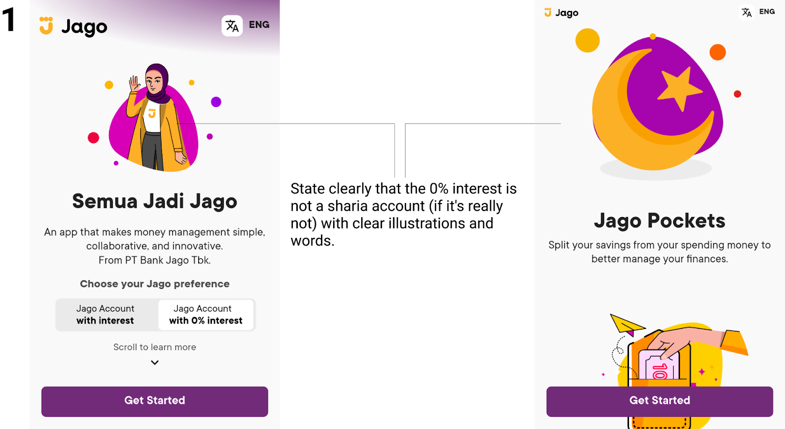
| 2. Match between system and the real world The design should speak the users’ language. Use words, phrases, and concepts familiar to the user, rather than internal jargon. Follow real-world conventions, making information appear in a natural and logical order. | There are two types of account, the regular with interest and 0% interest. The illustration seems to tell that the 0% interest is a sharia type of account, but there is no clarity as to whether this one is really one or not. | 3 |
| 3. User control and freedom Users often perform actions by mistake. They need a clearly marked “emergency exit” to leave the unwanted action without having to go through an extended process. | Once the email and phone entered, the process can’t be cancelled though it can be replaced.In the registration process, users can go back to the previous step anytime they want. | 2 |
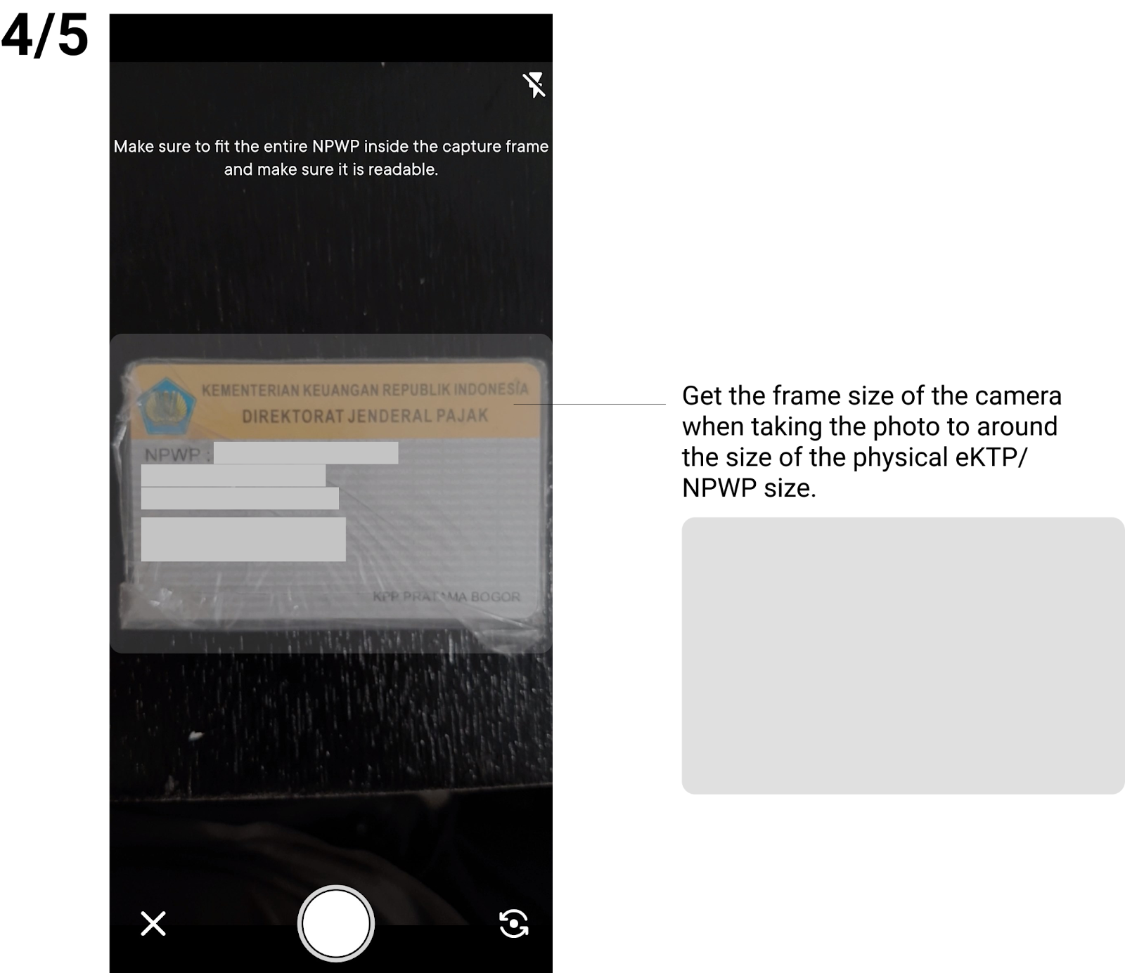
| 4. Consistency and standards Users should not have to wonder whether different words, situations, or actions mean the same thing. Follow platform and industry conventions. | During step 6, even though the app is in English, the language selector says so. The terms and conditions are still in Indonesian. During step 3 and 4 to take pictures of eKTP and NPWP, the frame size was not the exact size. An area around the upper and bottom of the card was also taken. Overall design is consistent throughout the registration process except on the screen before verification. Icons shown here use different colours each, meanwhile throughout the app is yellow. | 1 |
| 5. Error prevention Good error messages are important, but the best designs carefully prevent problems from occurring in the first place. Either eliminate error-prone conditions, or check for them and present users with a confirmation option before they commit to the action. | The password is required to include lowercase, uppercase, numbers and characters which were communicated well through icons with labels underneath. During step 4, “Work Address”, the edit form only accepts one character and informs it is invalid and has to enter the valid one. | 4 |
| 6. Recognition rather than recall Minimize the user’s memory load by making elements, actions, and options visible. The user should not have to remember information from one part of the interface to another. Information required to use the design (e.g. field labels or menu items) should be visible or easily retrievable when needed. | After finishing up all the steps without verification. The feature on the app is still inaccessible with a reminder to do the scheduled video call or immediately. During step 4, no real explanation as to why users have to input the information and which ones are mandatory. It causes users to guess which information to give or just complete all of them to continue to the next step. | 3 |
| 7. Flexibility and efficiency of use Shortcuts — hidden from novice users — may speed up the interaction for the expert user such that the design can cater to both inexperienced and experienced users. Allow users to tailor frequent actions. | Video call activation could be started immediately or scheduled maximum 1 week ahead. The time for the scheduled video call can be selected as early as 00:00 and as late as 23:00. By the information given, the calendar link will be sent via email, though no email received. There was a notification from the app exactly the same as the time scheduled before. During step 4, the search option on the company industry is not working, so users need to scroll through the options one by one. An issue for this dropdown as the options are not as few as other dropdowns. | 3 |
| 8. Aesthetic and minimalist design Interfaces should not contain information which is irrelevant or rarely needed. Every extra unit of information in an interface competes with the relevant units of information and diminishes their relative visibility. | The design is easy to see and eye catchy that it really suits people around 18-40. Most of the screens are responsive due to the need of a keyboard to show up. Unfortunately the animation was janky, even for a mid-end device from 2019 (Samsung A50). Certainly it would be worse on older and lower end devices. | 3 |
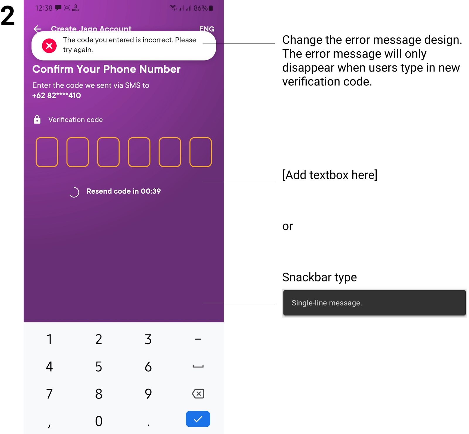
| 9. Help users recognize, diagnose, and recover from errors Error messages should be expressed in plain language (no error codes), precisely indicate the problem, and constructively suggest a solution. | When entering the wrong verification code for a phone number, the error was informed well. But the error was shown in a toast manner that disappeared within seconds. | 2 |
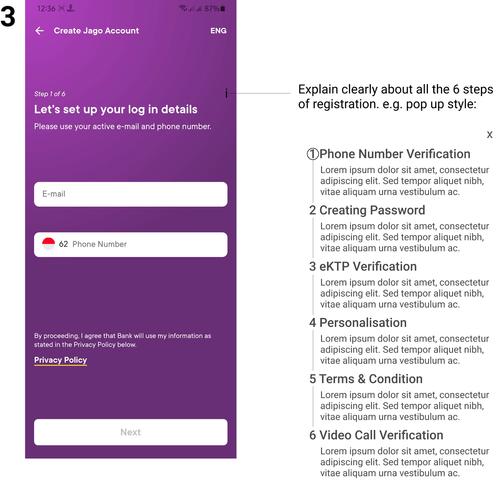
| 10. Help and documentation It’s best if the system doesn’t need any additional explanation. However, it may be necessary to provide documentation to help users understand how to complete their tasks. | The steps were informed on top of the screen (e.g Step 2 of 6) though there was no further explanation on what all these 6 steps all consist about. Other than the privacy policy right before the registration process and terms & conditions right before the video verification process, there is no more documentation to help users with the process. | 2 |
User Journey

Improvement Suggestions and Alternatives
As the issues arise from the heuristic evaluation, there are also some improvements added on the opportunities already addressed on the user journey. Then to sum it up, I categorise the improvements to non-visual and visual.
Non-visual Improvements
| # | Issues | Suggestions and Alternatives |
| 1 | Introduction of the two available account types always shown after opening the app for the first time. | Only show the introduction screen for unregistered users. (before registering) |
| 2 | Once the email and phone entered, the process can’t be cancelled though it can be replaced. | Give option to retract wrongly entered email and phone number. |
| 3 | “Work Address” text form only accepts one character and informs it is invalid and has to enter the valid one. | Fix the programatically error on “Work Address” field. |
| 4 | NPWP frame size was not the exact size. An area around the upper and bottom of the card was also taken. | Fix the programatically search on the company industry field. |
| 5 | Even though the app is in English, the language selector says so. The terms & conditions are still in Indonesian. | Make the terms & condition language synchronous with the selected app language. |
| 6 | The time for the scheduled video call can be selected as early as 00:00 and as late as 23:00. By the information given, the calendar link will be sent via email, though no email received. There was a notification from the app exactly the same as the time scheduled before. | State that there will be a notification from the app not via email. |
| 7 | Give notification prior to the scheduled time not at the time the video call will start. | State that there will be a notification from the app not via email. |
Visual Improvements
| # | Issues | Suggestions and Alternatives |
| 1 | There are two types of account, the regular with interest and 0% interest. The illustration seems to tell that the 0% interest is a sharia type of account, but there is no clarity as to whether this one is really one or not. | State clearly that the 0% interest is not a sharia account (if it’s really not) with clear illustrations and words. |
| 2 | When entering the wrong verification code for a phone number, the error was informed well. But the error was shown in a toast manner that disappeared within seconds. | Change the error message design to a snackbar type or just text that part of the screen. The error message will only disappear when users type in new verification code. |
| 3 | The steps were informed on top of the screen (e.g Step 2 of 6) though there was no further explanation on what all these 6 steps all consist about. | Explain clearly about all the 6 steps of registration. |
| 4 | eKTP frame size was not the exact size. An area around the upper and bottom of the card was also taken. | Get the frame size of the camera when taking the photo to around the size of the physical eKTP size. |
| 5 | NPWP frame size was not the exact size. An area around the upper and bottom of the card was also taken. | Get the frame size of the camera when taking the photo to around the size of the physical NPWP card size. |
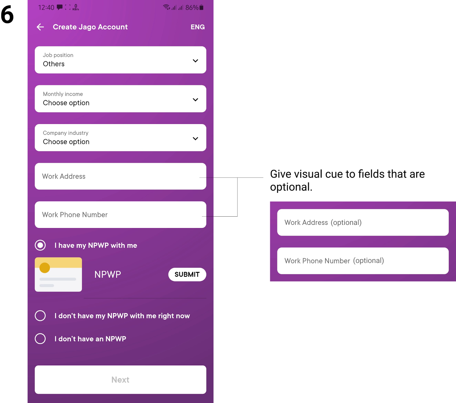
| 6 | No real explanation as to why users have to input the information and which ones are mandatory. It causes users to guess which information to give or just complete all of them to continue to the next step. | Give visual cue to fields that are optional. |
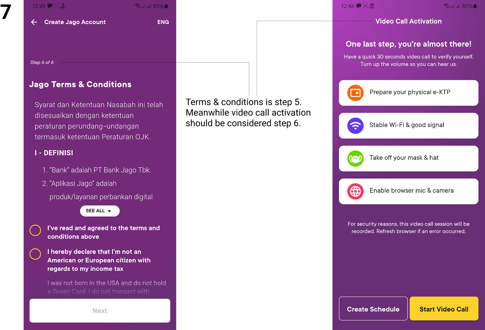
| 7 | After step 4 (personalisation), the next step is numbered 6 (terms & condition) not 5. | Terms & conditions is step 5. Meanwhile video call activation should be considered step 6. |
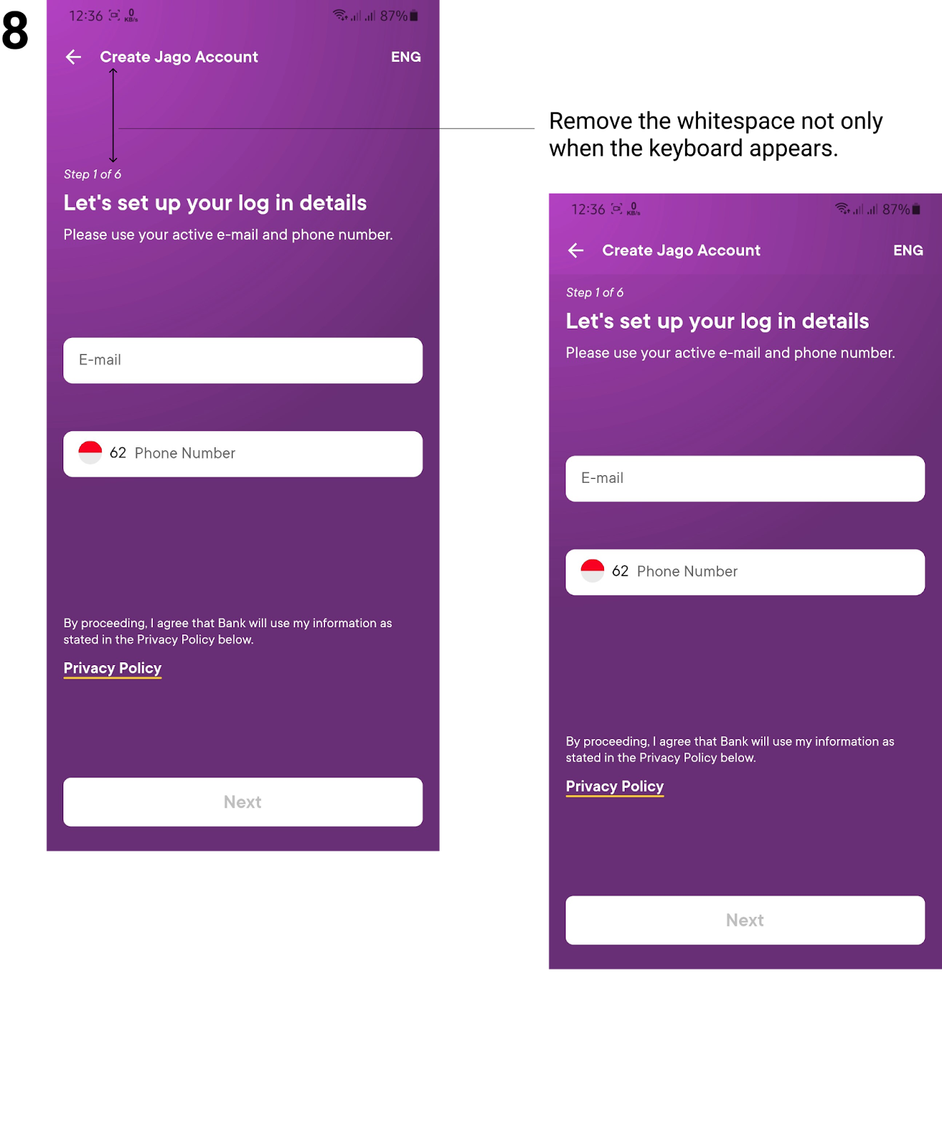
| 8 | Unnecessary whitespace on top of steps though disappeared when the keyboard appears. | Remove the whitespace not only when the keyboard appears. |
Also to give a better visualisation, here are some illustration for the UI based improvements: